

Bei Qualitätsprüfungen wurde festgestellt, dass es bei der Produktion des „freibeik“-Sattelgelenks in einzelnen Fällen zu Lufteinschlüssen im Alugussteil des Sattelgelenks gekommen sein könnte, so der Hersteller in einer Pressemeldung.Das Sattelgelenk darf nicht mehr verwendet werden. Es besteht die Gefahr, dass das Sattelgelenk bricht. Das Produkt wird vorsorglich zurückgerufen. Die Vertriebspartner wurden bereits informiert und Kunden des Sattelgelenks können diese zurückgeben. Bei Fragen können sich Kunden beim Kundendienst unter der Nummer: +49 (0) 38851 314 314 0 melden.
Ein gutes Fahrrad ist mehr als nur etwas Stahl, Aluminium, Carbon und etwas Gummi. Bei einem guten Fahrrad oder E-Bike sind die verschiedenen Komponenten aufeinander abgestimmt. Dazu zählt auch der Fahrradsattel und die Sattelstange, um die korrekte Ergonomie zu erreichen. Mit dem Freibeik Sattelgelenk gibt es ein neues Gadget im Fahrradsektor. Gefederte Sattelstützen und nachgebende Sättel kennen wir bereits, diesmal schauen wir uns im Freibeik Test ein Sattelgelenk an.
Inhaltsverzeichnis
Das Freibeik Sattelgelenk
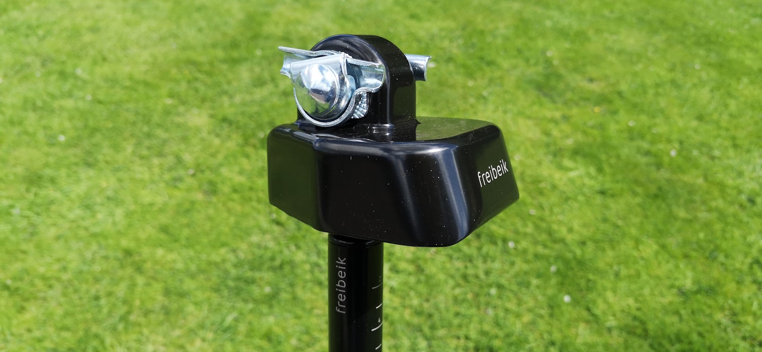
Das Freibeik Sattelgelenk gibt bei der Tretbewegung dem Sattel die Möglichkeit, sich nach links, rechts, oben und unten zu neigen und sich ebenfalls in die Richtungen zu drehen. Dadurch soll die Tretbewegung noch runder und das Becken und die Hüfte entlastet werden, so das Versprechen der Hersteller. Dies soll Schmerzen beim Fahrradfahren reduzieren. Ebenfalls soll der Schulterblick erleichtert werden, da die Drehbewegung das Sichtfeld vergrößern soll. Erfunden wurde Freibeik von der Erfinderin Iris-Sabine Langstädtler aus Bremen. Besonders bekannt wurde das Gelenk durch die Gründershow „Die Höhle der Löwen“, in der die Bremerin einen Deal mit Ralf Dümmel und Carsten Maschmeyer machen konnte.
Lieferumfang und Zubehör vom Freibeik Sattelgelenk
Geliefert wurde das Sattelgelenk in einem Handelskarton, der von außen bereits den Inhalt aufzeigt und mit einem „Bekannt aus der Gründer Show Die Höhle der Löwen“ gekennzeichnet ist.
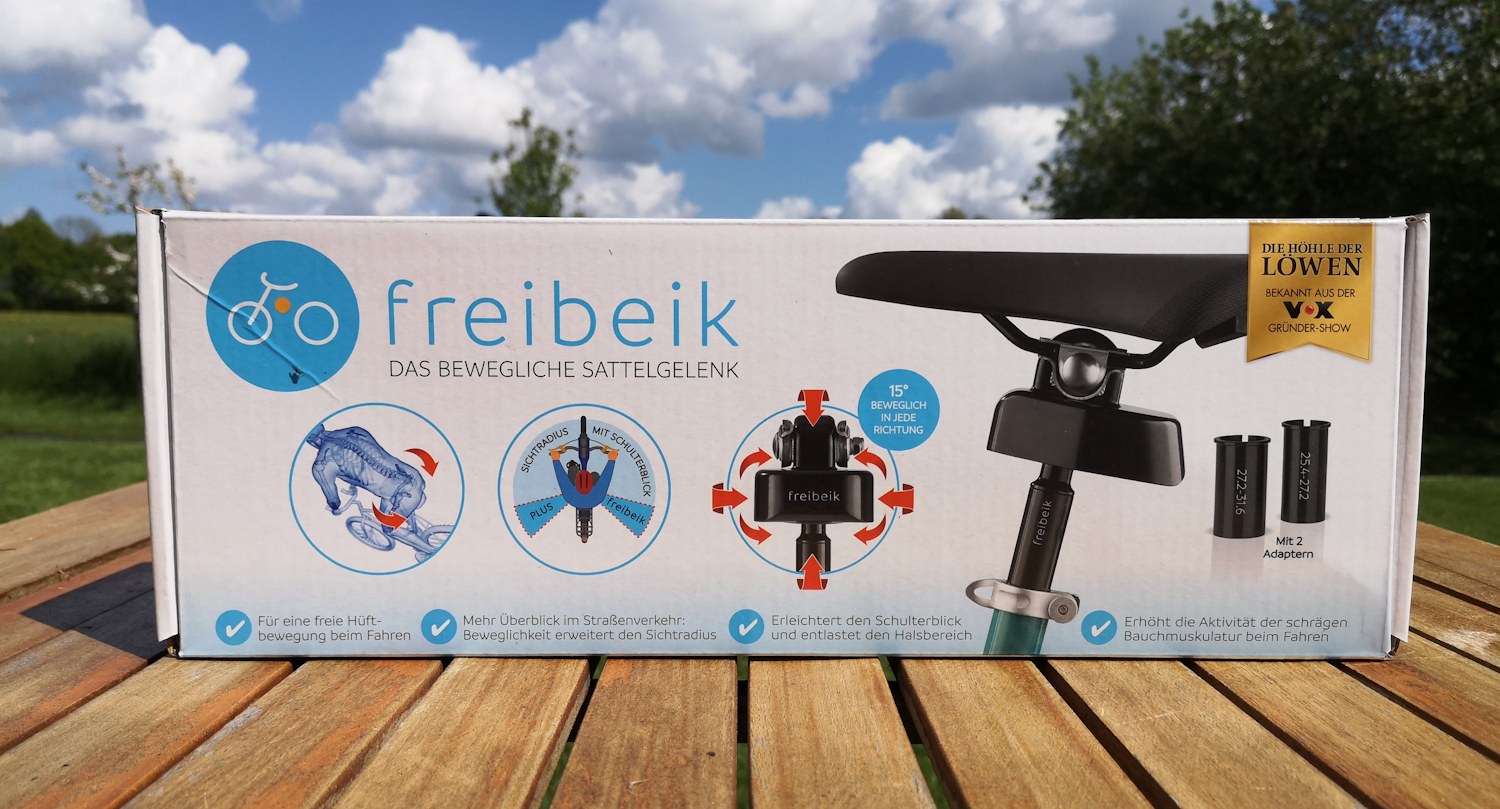
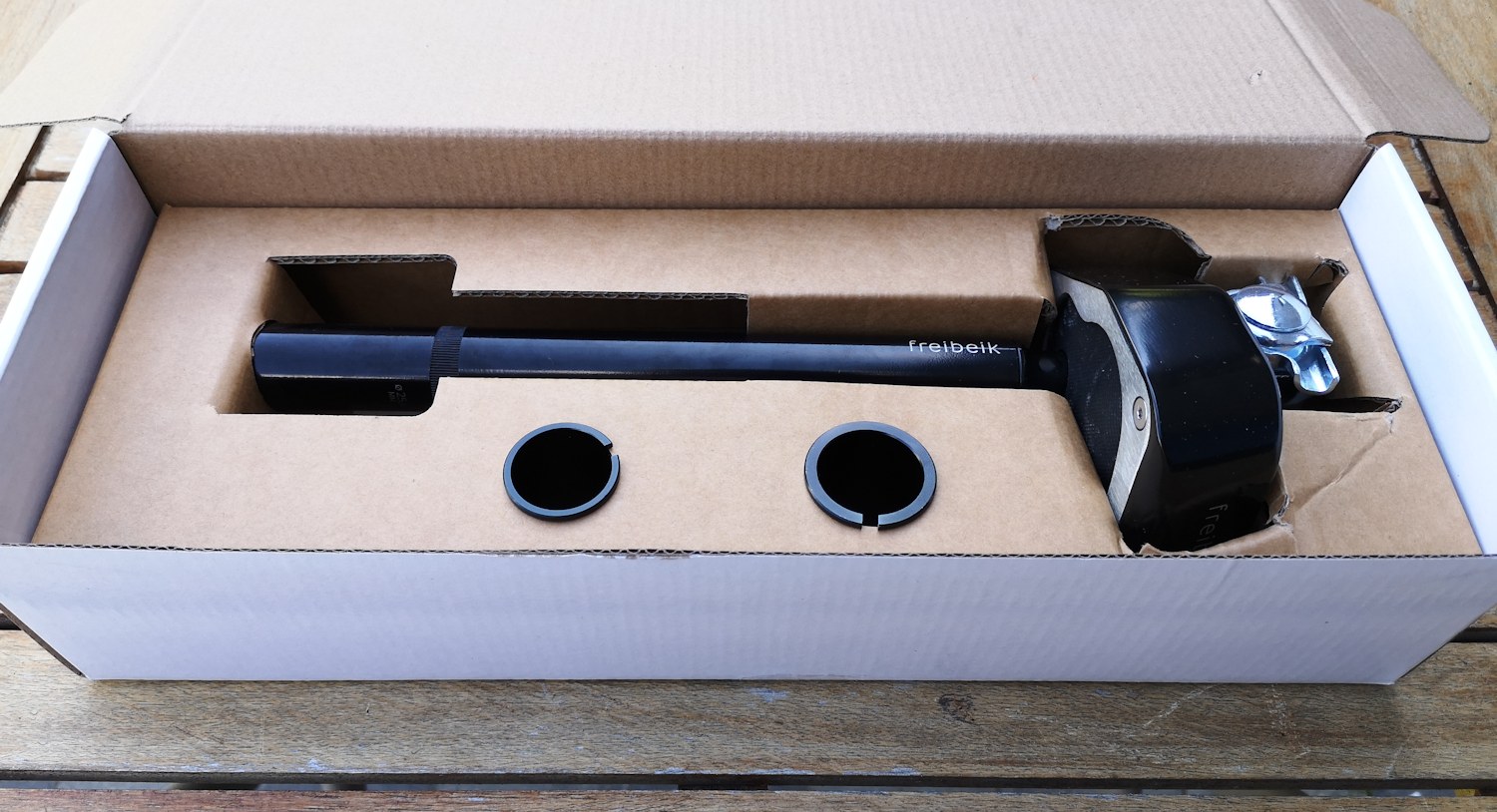
Beim Öffnen des Kartons fällt einem direkt ein roter Warnzettel auf. Unter dem Zettel finden wir ein Handbuch in verschiedenen Sprachen, eine Sattelstütze mit dem Sattelgelenk und zwei Reduzierhülsen. Der rote Zettel trägt einen deutlichen Hinweis zur Norm EN 15194 und dem Systemgewicht von 100 kg, dazu später mehr.
Verarbeitung und Haptik – Freibeik
Nimmt man das Sattelgelenk aus dem Karton, wirkt dies wertig. Es bringt ein gewisses Eigengewicht mit und wir haben keine Produktionsrückstände oder scharfe Kanten an unserem Modell gefunden. Die Unterseite des Gelenks wirkt gekonnt und sauber verarbeitet und ist verschraubt. Insgesamt macht das Freibeik-Gelenk einen wertigen und guten Eindruck auf uns.
Technische Details laut Hersteller
Der Hersteller gibt ein Sattelgelenk inklusive Sattelstütze und zwei Reduzierhülsen mit. Die Sattelstütze selbst hat einen Durchmesser von 25,4 mm und die Reduzierhülsen bieten die Möglichkeit, die Sattelstütze in Sattelrohren mit verschiedenen Innendurchmessern zu befestigen.
- 25,4 bis 27,2 mm und 27,2 bis 31,6 mm
- Das Systemgewicht des Sattelgelenks darf 100 kg nicht überschreiten.
- Wir haben die Freibeik Sattelstütze mit 0,815 kg (815 g) gewogen (ohne Sattel).
Hinweis zum Systemgewicht
Fahrrad / E-Bike, Fahrer, Fahrradtaschen und alles, was es an Anbauten gibt, zählen hier dazu. Legt man ein E-Bike Gewicht von 22 bis 26 kg zugrunde, bleiben noch 78 bis 74 kg für den Radfahrer über. Das kann in Kombination mit beladenen Fahrradtaschen aber auch bei großen und normalgewichtigen Menschen durchaus zu einem Problem werden. Hier würden wir uns für Modell-Upgrades wünschen, dass das zulässige Systemgewicht erhöht wird.

Freibeik Montage am Fahrrad
Die Montage unterscheidet sich kaum vom Anbau einer herkömmlichen Sattelstütze und dem anschließendem Anbringen eines Sattels, mittels Sattelkloben. Wir haben in der Vergangenheit ein Video dazu erstellt: https://www.youtube.com/watch?v=atCfOt1D8Jw
Die bisherige Sattelstütze wird samt Sattel herausgenommen, der Sattel wird gelöst und im Anschluss auf die Freibeik Sattelstütze geschraubt. Wir empfehlen vorher jedoch, die aktuelle Sattelhöhe einmal auszumessen, um diese später wieder einstellen zu können.
Das Sattelgelenk ist recht breit, auch der Teil, der zwischen die Sattelstreben kommt. Wir haben an dieser Stelle einen minimalen Krafteinsatz benötigt. Die Sattelstütze wird im Anschluss in den Rahmen gesteckt. Ist der Durchmesser des Rahmenrohrs zu groß, kann mit der passenden Reduzierhülse der korrekte Innendurchmesser erreicht werden. Die Reduzierhülsen passen bei uns gut und ließen sich auch einfach einschieben.
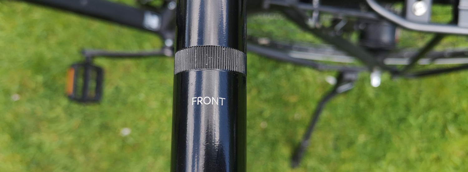
An der Sattelstütze befindet sich eine Aufschrift mit den Worten „Front“, dieser Teil zeigt zum Lenker. Ebenso ist auf die Einschubtiefe zu achten, diese ist mindestens bis zu der Markierung „STOP Min Insertion“ einzuschieben.
Einsatz in der Praxis
Der spannendste Teil kam nach der Montage. Die erste Fahrt mit dem neuen Sattelgelenk. Das Fahrgefühl ist neu und anders als mit einem starren Fahrradsattel. Die Drehbewegung nach links und rechts können wir aktiv beim Fahren spüren. Die Bewegung ist deutlicher und umfänglicher als bei „Active“ Sätteln, die einen ähnlichen Effekt versprechen. Am Anfang hatten wir das Gefühl, dass der Sattel nicht ganz fest ist. Dieser Eindruck täuschte, da es sich lediglich um die gewollten Bewegungen des Sattelgelenks handelte und man dies nicht gewohnt ist. Nach kurzer Zeit stellte sich bei unserem Testfahrer bereits ein Gewöhnungseffekt ein.
Beim Abbiegen und Antreten haben wir die seitliche Rotation ebenfalls merken können. Nach dem Aufsteigen auf den Sattel haben wir die auch die vertikale Neigungsmöglichkeit des Sattels gespürt, dazu später mehr im Fazit. Wir haben das Freibeik Sattelgelenk sowohl mit unserem Crossbike und City-Cross-Bike ausprobiert. Unsere Sitzposition ist dabei etwas nach vorne gebeugt.
Freibeik Sattelgelenk am Fahrrad und beim Fahren
Fazit zum Freibeik Sattelgelenk Test
Nachdem wir einige Kilometer mit dem Freibeik Sattelgelenk gefahren sind, können wir verschiedene Dinge für uns festhalten. Das uns vorliegende Sattelgelenk ist einfach in der Anwendung und gut verarbeitet. Nach einer kurzen Distanz haben wir uns teilweise an den beweglichen Sattel gewöhnt. Die Bewegung auf der horizontalen Achse, nach links und nach rechts, finden wir gut. Das Gelenk bewegt sich nur soweit mit, wie wir es benötigen. Beim Losfahren bewegt sich der Sattel etwas mehr als während der normalen Fahrt.
Unser Testfahrer hat seinen Sattel auf der normalen Sattelstütze so ausgerichtet, dass der Sattel parallel zum Untergrund steht und damit nicht drückt. Durch die Bewegungsmöglichkeit, die der Sattel mit dem Freibeik Sattelgelenk bekommt, kann sich die Sattelspitze jedoch auch leicht himmelwärts bewegen (siehe Video). Diese Bewegung, wenn sie auch klein war, ist ungewohnt und war für unseren Testfahrer stellenweise ungewollt und merkbar.
Generell lässt sich sagen, dass ein Fahrrad immer auf die persönlichen Bedürfnisse angepasst und eingestellt werden muss. Am Freibeik Sattelgelenk gibt es keine Einstellungsmöglichkeiten für den Fahrer. Zum Zeitpunkt des Tests kostete das Freibeik Sattelgelenk 69,99 Euro.
Wir haben das Sattelgelenk im Langzeittest und ergänzen unsere Erfahrungen stetig. Dies kann auch eine Anpassung unserer Wertung zur Folge haben.
Transparenz: Das Sattelgelenk haben wir auf Nachfrage der Redaktion von der DS Produkte GmbH erhalten.